Entrepreneurial app, website and brand redesign endeavor for a product that helped manage wait times while allowing users to use their Wait Time as Free Time during long queues.
Client
WaitBuddy
Role
Wireframes
Prototypes
Branding
Iconography
Tools
Sketch
Adobe CC
UX/UI Design
User Research
User Testing
QA/UAT
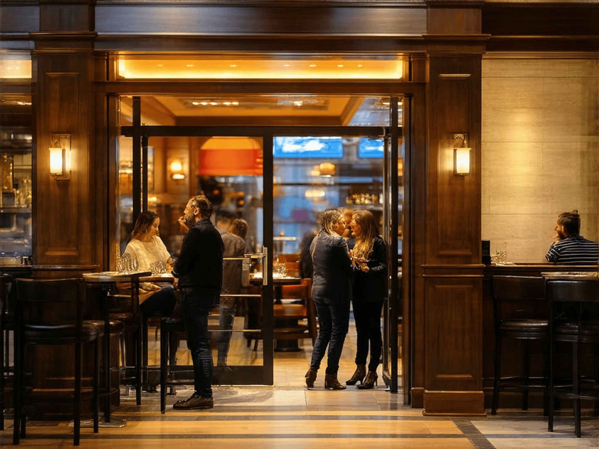
WaitBuddy was conceived to be the ultimate convenience app designed for the modern foodie who values their time. Say goodbye to the frustration of waiting in long lines and hello to more enjoyable experiences and getting things done! Instead of waiting in an awkwardly crowded and confined area with a bunch of strangers, the WaitBuddy app holds your place in queues, allowing you to go run errands, take a walk, explore nearby shops and cafés, or simply relax while we handle the waiting for you.
THE CHALLENGE
Coming in as the newly appointed entrepreneurial lead designer, my mission was to transform WaitBuddy into the quintessential app for modern foodies seeking to maximize their leisure time instead of waiting in line. The initial version of the app had served its purpose as an MVP, but there were plenty of opportunities for improvement. As a designer, the task was to conduct a comprehensive audit of the app, suggest improvements, manage a visual and strategic rebrand, and create and oversee omnichannel marketing efforts across social media, digital, and print to increase user engagement and retention. The challenge consisted of the following key areas:
The Goal
Improve the UX/UI, branding and marketing to look and feel more professional and user friendly, thereby attracting and retaining loyal users.
Elevate WaitBuddy from just a tool people use to a beloved lifestyle companion, making our users' experiences not only more convenient but truly delightful.
UX/UI Overhaul
Audit the existing app, website and digital touch points in order to provide constructive criticism and suggestions for improvements.
Evaluate and redesign the user interface to ensure a seamless, engaging, and user-friendly experience.
Integrate intuitive navigation and personalized features that resonate with our primary audience - women aged 24-50 with a passion for food and drink.


UX/UI Enhancements

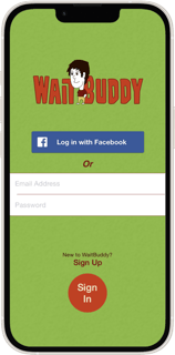
Before


Loading Screen

After
The logo was refreshed to have a more gender-neutral design, and a concise tagline was added to clearly convey the app’s purpose at a glance. This updated logo seamlessly transitions into a user interface, indicating readiness to be served—effectively replacing the prior lengthy and unpolished animated video.
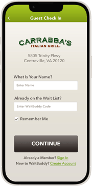
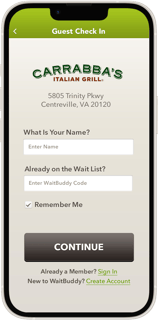
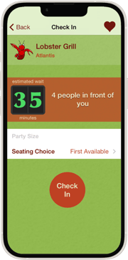
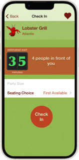
Before
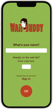
Guest Check In
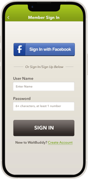
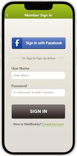
After
Member Sign In
Before
After

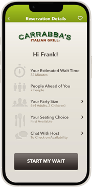
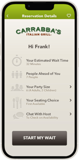
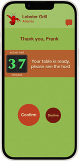
Before
Reservation Details
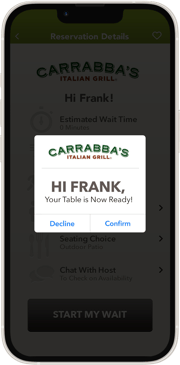
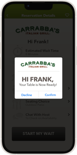
After
Table Ready Confirmation
Before
After
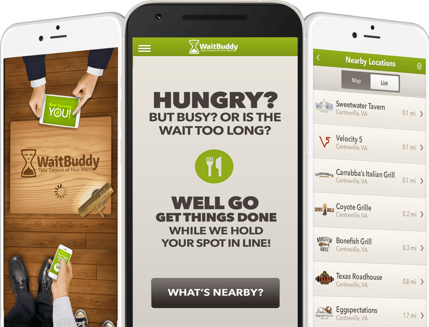
Before

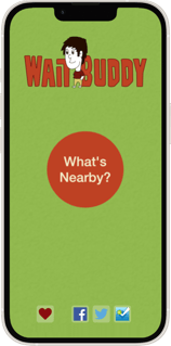
"What's Nearby?" Screen
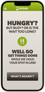
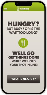
After
New palette, benefit statements and a clearer CTA added. Logo downplayed.
Confusing social buttons moved to the ancillary burger menu.
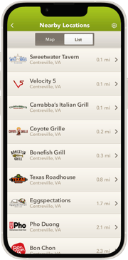
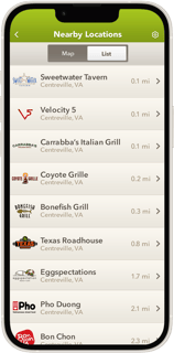
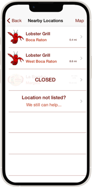
What's Nearby? (List View)
Before
After
What's Nearby? (Map View)

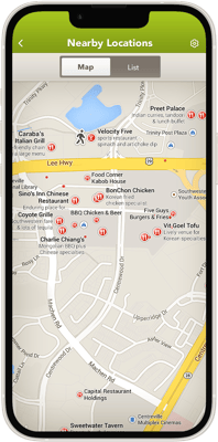
Segmented control & filters added to create a singular screen map experience that previously required users to go through several steps.
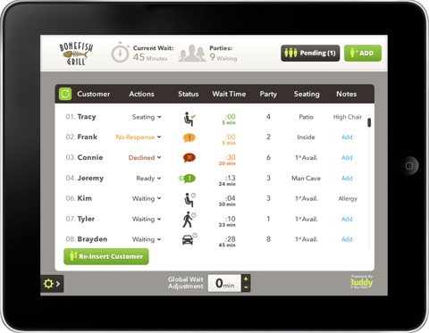
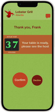
Wait Management App
The Wait Buddy wait management client side app allowed restaurants to track, prepare for, cater to and alert their customers and parties accurately and efficiently. The main screen is shown below.
Branding Overhaul
Develop a fresh brand identity that embodies the essence of freedom, leisure, and modernity.
Ensure the new brand and marketing aesthetics align with the lifestyle aspirations of our target audience, creating a cohesive visual language across all touchpoints.
Incorporate aesthetic of ‘leisure time’ to evoke a feeling of being stress free while a user’s place is being held for them.
Develop a brand that feels environmentally friendly, sophisticated and approachable.
Marketing Strategy
Craft compelling, targeted social media campaigns to raise awareness and drive user engagement.
Design eye-catching digital and print marketing materials to attract and retain users, ensuring messaging is consistent and reflects the app's innovative spirit.
Leverage foodie-centric content to showcase the app’s benefits and connect with our audience’s interests.
Promote additional uses in secondary markets such as auto mechanic garages, banks, DMV etc.
User Research & Growth
Implement strategic enhancements aimed at increasing user retention, satisfaction, and long-term growth such as weekly drawings/giveaways for sharing the app and WaitBuddy experiences etc.
Utilize user feedback and analytics to continually refine and innovate the app’s offerings.

Logo & Identity
Before
After


Before
After
The rebrand sought to convey a sense of approachability and environmental consciousness that would appeal to women 24-50. To achieve this, we replaced the existing male focused 'buddy' and harsh red tones with a welcoming and less masculine hourglass mascot/logomark and earth tones. This new symbol not only signifies the friendly assistance provided by the app but also highlights the enjoyable free time users gain by efficiently managing their wait periods.


Business Card
By redesigning the old logo, swapping the vibrant red with the desired earthy palette, rounding the corners slightly and adding a tagline, the brand instantly felt more approachable and environmentally conscious.
THE APPROACH
Strategic Planning
Defined project objectives, engaged key stakeholders, and helped fine tune the project plan.
Research & Analysis
Conducted user and competitive research to identify needs and opportunities, and audited the current app for improvements.
Specifications Development
Developed new feature specifications and set branding guidelines.
Design Phase
Created wireframes, high-fidelity designs, and prototypes, for the website and all app screens using feedback from user testing and peer reviews to iterate on the design and experience effectively and efficiently.
Product Development
Worked closely with the development team using agile methodologies for feature implementation and conducted rigorous quality assurance tests.
Marketing Development
Planned and executed comprehensive omnichannel marketing strategies for both online and offline initiatives. Created social media presence and digital advertising initiatives to penetrate and attract existing groups as well as organic new users.
Launch & Delivery
Rolled out the final product, supported it with strategic marketing, and ensured smooth deployment across platforms with extensive and rigorous QA/UAT.
Post-Launch Evaluation
Continued with a rigorous QA/UAT process to insure an engaging and bug free experience. Monitored performance, user engagement and feedback to faciliating planning for future improvements and enhancements.
THE RESULT
Before the transformation, WaitBuddy was a functional app that served its primary purpose, but lacked the engaging user experience and cohesive brand identity needed to captivate its target audience. The app's design was somewhat static and the branding failed to connect with the dynamic lifestyle of modern foodies.
The revamped WaitBuddy brand, app and website received positive feedback for its user-friendly and visually appealing design. The rebranding efforts successfully revitalized the market image, leading to increased user engagement and retention. The strategic marketing campaigns broadened our reach, securing its position as a favored app for time-conscious foodies, and creating a sustainable foundation for future growth and updates. WaitBuddy was ultimately acquired and absorbed by Open Table.
Need Help or More Samples?
DARREN KURRE
Investigate | Ideate | Iterate | Innovate