The Great Courses mobile app was designed to allow users who purchased courses from thegreatcourses.com to view their courses anywhere instead of just on the web. I inherited Version 1 of the app which had many shortcomings that needed addressing. The app went through many iterations during my time there, each incrementally improving based upon user interviews, remote user testing both low and hi-fi prototypes and by hugging our haters who were roasting V1 in app store reviews. Most people don't tell you when they love something, but my gosh, if they don't like something they will be all over you like stink on you know what! Through the aforementioned and various app monitoring software such as Appfigures and Apptentive (now Alchemer) we were able to monitor our user feedback for live apps, analyze the findings and pivot when and where needed. Several of the resulting UX/UI improvements of the latest build are showcased below.
Role
Journey Maps
Prototypes
User Testing
UX/UI Design
Client
The Great Courses
Tools
Axure
Figma
Usertesting.com
Appfigures
Apptentive
Sign In Screens


My Library & Lists
As die hard lifelong learners continued amassing video and audio courses over years of being a customer, the need to sort, filter, arrange and archive content became more and more coveted by The Great Courses userbase. The following screens depict some major improvements that increased not only visits to the app, but also purchases due to content being much easier to find, sort and consume.


Search
As with My Library, search became more and more crucial for users that had amassed very large libraries. The first few releases didn't even include search given that the average user had less than 10 courses, however more and more customers starting buying courses en masse-one of them being Bill Gates... he even showed his Great Courses Collection off on an episode of 60 Minutes! Anyway, search was born as large libraries started becoming more common. Several key screens are shown below.


Audio/Video Player
After launching a traditional media player for an MVP and then studying our users in context, through remote and in-lab user testing, conducting interviews, benchmarking the industry and closely monitoring our user feedback at all levels, we drastically improved our player to suit the needs of our users and their modes of engagement.


My Downloads
The only way to download lectures and view downloaded content in previous builds was on course pages. I spearheaded a global downloads section where users can quickly access and manage their downloaded content while measuring and contrasting their devices storage capacity. Users really took to the new feature and consumption more than tripled.


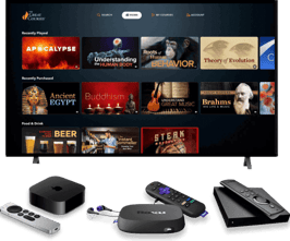
OTT apps (and channels) followed the same process as the responsive Great Courses website and apps. You can view/download the apps or explore the designs below
OTT APPS/CHANNELS
MORE PROJECTS
There were several website redesigns during my tenure at The Great Courses. Explore some of the Key Designs and areas of improvement for the latest redesign or view the Live Site.


WEBSITE REDESIGN
View some of my recent projects spanning web, app and SVOD apps/channel experiences, branding, omni-channel marketing and more. Please contact me to request more.


