


Website Redesign
I had the good fortune to work closely with 3 Pillar Global while redesigning the TGC website. We worked collaboratively, as a global team, to overhaul the entire site through research, wires, testing, both low and hi-fi prototypes, and final design/product delivery for hundreds of pages and breakpoints. This was all achieved in a few short months by starting with a robust design system and maintaining a well-informed, close-knit team throughout the project.


|
We were able to design and deliver hundreds of screens and components across 7 breakpoints in a few short months by starting with a well thought out and executed Design System. Robust design systems help provide a nearly-lossless handoff from design to production with minimal effort from either side when done properly, which is exactly what transpired during this effort. It ensured consistency across a complex product and distributed teams, streamlined development, and created an optimal user experience and end product. Some elements from within the Design System are showcased below.
Archetypes
DESIGN SYSTEM
Design System
Role
Journey Maps
Prototypes
User Testing
UX/UI Design
Tools
Abstract
Axure
Invision
Figma
Usertesting.com
Responsive Grid System


The grid system includes 10 breakpoints which defines the basis of all designs from OTT app experiences, across responsive web, and down to mobile and tablet app layouts. Three breakpoints are shown below.
Text Scale & Style Samples


Icon Definitions
We were able to save considerably on load time and space by using Font Awesome icons. They are highly efficient CSS byproducts that deliver better performance and speed because of fewer HTTP requests. Font Awesome icons load much faster than inline SVGs, PNGs or JPEGs.
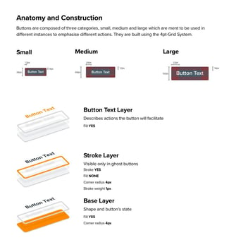

Button Definitions
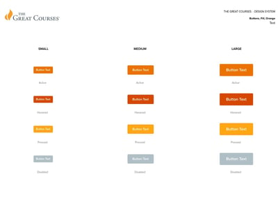

We developed a robust button asset system that included hundreds of permutations, both with and without icons on either side of the text as well as twirldowns for droplists. All buttons and other components and widgets are easily accessible within the Sketch and Figma inspector interfaces, library systems or from within each defined section of the design system.


Form Elements


DESIGN SAMPLES
Hundreds of wireframes, components, widgets and page designs were produced during this redesign project. By using Sketch and Abstract together we were able to work in the same files effectively, efficiently and at the same time prior to our migration to Figma. There are way too many to showcase so I am only showcasing a handful of experiences. Please feel free to contact me to request more design samples.
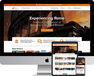
Homepage
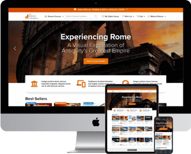

The homepage was redesigned to reduce the amount of visual noise and friction users were previously presented with based upon Hick's Law which is a simple idea that says that the more choices you present your users with, the longer it will take them to reach a decision. With this in mind, the multitude of 'Deals' that were previously front and center were rolled up into a global 'Deals Banner' which made them less distracting on the homepage, but left them accessible globally which increased conversion considerably. The main navigation and mega menu were both rearchitected to be more streamlined and user friendly as well and several previously hard-to-find features were surfaced for the user. Search was also dramatically improved both in a UX/UI sense as well as load time.


Improved Search
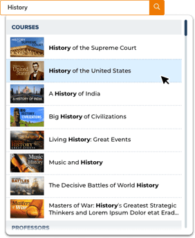

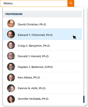
Global search was completely overhauled to be much more streamlined and efficient while being more robust in nature by implementing live predictive search results for both courses and professors. Course art was also added to help customers quickly scan for the artwork they had seen previously in our course catalogue or online.

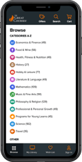
Improved Browse Experience


After several prototyped user tests, it was learned that removing several marketing items, alphabetizing the categories and adding color coded icons to each category greatly improved discoverability and time to target as set forth in both Hick's Law and Fitts' Law. Desktop 'browse' utilized a large droplist 'mega menu' while mobile took advantage of a full 'browse' page experience.
Desktop Browse Mega Menu
Mobile Browse Page


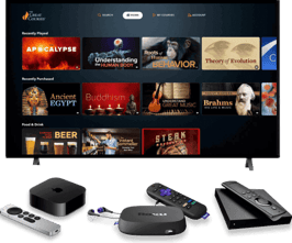

OTT apps (and channels) followed the same process as the responsive Great Courses website and apps. You can view/download the apps or explore the designs below
OTT APPS/CHANNELS
MORE PROJECTS


Mobile and tablet apps went through many iterations as well. Some required external agency integrations while the last few were completed 100% in-house. You can view the work below.
MOBILE & TABLET APPS
View some recent projects spanning web, app and SVOD apps/channel experiences, branding, omnichannel marketing and more. Please contact me to request more.
DARREN KURRE
Investigate | Ideate | Iterate | Innovate